
When Anchor & Bloom Play Therapy approached me, the goal was clear: create a brand and website that stood out in a crowded market while staying true to their authentic, professional, and empathetic approach to therapy.
Play therapy is often misunderstood. While the word “play” suggests light-hearted fun, the reality is that it is a powerful, and often serious, way for children to process deep emotions. The brand needed to balance these two truths: warm and welcoming for families, but professional and trustworthy enough for parents to feel confident in choosing Anchor & Bloom.
The Challenge
The play therapy space is saturated with websites and brands that feel identical — names like “Rainbows” and “Roots,” cluttered layouts filled with jargon, and visuals that look dated or overly corporate. Parents searching online often encounter confusing information, making it harder for them to take the important first step of reaching out.
Anchor & Bloom’s founder was determined to do things differently. She wanted a brand that was:
- Playful but not childlike
- Professional without feeling corporate
- Authentic, modern, and captivating
- Simple and efficient for busy parents who need to book quickly
Her vision was to be instantly recognisable, trustworthy, and fresh — a brand that felt approachable and knowledgeable at the same time.
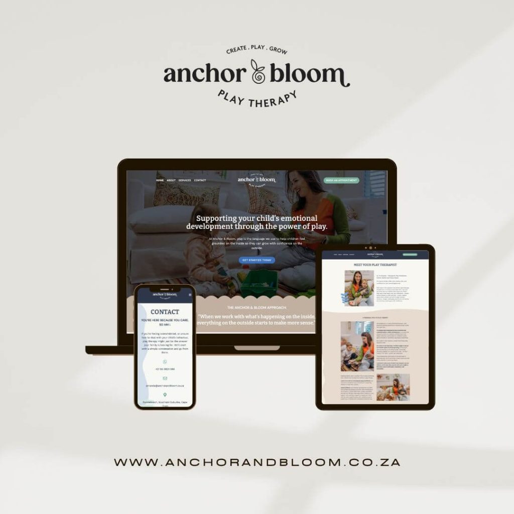
The Design Solution
This was a full-scope project: from logo and colour palette through to the design and build of the website.
- Logo Concept: The ampersand was reimagined as a symbol of growth, transforming into a flower in bloom. This visual metaphor represents the journey of children moving from seed to full bloom through play therapy.
- Colour Palette: Soft, natural tones to feel grounded and trustworthy, with subtle playful touches to keep the brand approachable.
- Typography: Clean, modern fonts that balance warmth and professionalism.
- Website Design: A streamlined, intuitive layout that avoids clutter. Parents can quickly understand what play therapy is, meet the therapist, and book an appointment without navigating overwhelming resources or technical jargon.
The entire design system reflects the brand’s ethos: simplicity, empathy, and professionalism.
The Result
The finished brand and website position Anchor & Bloom as both approachable and authoritative. Parents visiting the site immediately feel at ease, while the simple booking system removes the barriers that often prevent them from taking action.
- The brand identity communicates growth, care, and authenticity.
- The website simplifies a process that can often feel overwhelming, creating trust from the very first click.
- The overall experience captures the balance of professionalism and empathy that defines Anchor & Bloom.
Visit the Website
Explore the full brand and website here: www.anchorandbloom.co.za
This project is a perfect example of how thoughtful design can transform not just how a business looks, but how it feels to the people it serves.
